Best Apps to Plan Your Instagram Grid 2024

If you’re looking to elevate your Instagram aesthetic and create a visually cohesive feed, planning your Instagram grid is crucial. Fortunately, there are several apps available that can help simplify the process and make it more seamless. These apps offer a range of features that allow you to arrange, edit, and schedule your posts with ease, ensuring a consistent and visually appealing grid layout.
With the right apps, you can take your Instagram feed planning to the next level and captivate your followers with stunning grid designs. Whether you’re an influencer, content creator, or business owner, these apps are a must-have in your Instagram toolkit.
Key Takeaways:
- Planning your Instagram grid is essential for creating a visually appealing and cohesive feed.
- There are several apps available that can help streamline the grid planning process.
- Features offered by these apps include drag-and-drop functionality, unlimited grid space, analytics insights, and scheduling.
- Preview and Planable are two popular apps for Instagram feed planning.
- Experimenting with different grid layouts can create a unique and captivating feed.
Preview – The Ultimate Instagram Feed Planner App
Looking for the perfect tool to plan your Instagram grid? Look no further than Preview, the ultimate Instagram feed planner app. Trusted by millions of Instagrammers, content creators, and business owners, Preview offers a wide range of features that will take your grid planning to the next level.
With Preview’s intuitive drag-and-drop functionality, you can easily arrange your posts to create a visually stunning layout. Say goodbye to the hassle of manually rearranging your feed!
One of the standout features of Preview is its unlimited grid space. This means that you have complete freedom to experiment with different post combinations and themes until you find the perfect aesthetic for your Instagram feed.
But that’s not all! Preview also provides valuable analytics and insights, allowing you to track the performance of your posts and identify trends that resonate with your audience. This data-driven approach to grid planning will help you optimize your content and boost engagement.
Preview offers a wide selection of amazing filters and editing tools, allowing you to enhance your photos and maintain a consistent visual style throughout your feed. You can effortlessly create a cohesive and visually pleasing grid that reflects your unique brand or personal style.
Reposting content from other Instagram users is made easy with Preview’s reposting capabilities. Discover inspiring content and effortlessly share it with your followers, giving credit to the original creators.
But perhaps one of the most valuable features of Preview is its scheduling and auto-posting functionality. With Preview, you can plan and schedule your posts in advance, ensuring a consistent posting schedule even when you’re busy. You can even schedule and auto-post content to both Instagram and Facebook simultaneously, saving you time and effort.
Preview is a game-changer when it comes to Instagram grid planning. It offers a comprehensive set of tools and features that allow you to curate a stunning and cohesive feed, attract more followers, and elevate your Instagram presence.
With Preview, you can transform your Instagram feed into a work of art. Start planning your grid today and unleash your creativity!
Planable – The Drag-and-Drop IG Grid Maker
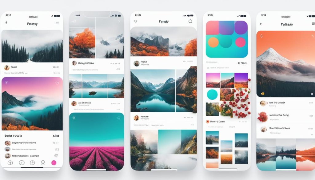
When it comes to organizing and planning your Instagram grid, Planable is the ultimate tool to consider. This versatile app offers a user-friendly drag-and-drop interface that allows you to easily arrange and rearrange your posts for the perfect layout. With Planable, you have full control over your Instagram feed organization, ensuring a well-structured and visually appealing presentation.
One of the standout features of Planable is its intuitive drag-and-drop functionality. Whether you’re a content creator or a social media manager, this feature allows you to effortlessly move posts around and experiment with different ideas for your grid. By visually arranging your content, you can ensure a cohesive and visually appealing Instagram feed.
In addition to its drag-and-drop capabilities, Planable also offers powerful editing tools. You can easily enhance your images, apply filters, and make sure they align with your overall aesthetic. With Planable, you can create a visually stunning grid that captures the attention of your followers.
But that’s not all – Planable takes Instagram grid planning to the next level by offering seamless collaboration features. You can work with team members, share ideas, and get feedback directly within the app. This collaborative approach ensures that your Instagram feed reflects the collective vision of your team.
Furthermore, Planable allows you to plan your social media calendar and schedule your posts in advance. This feature saves you time and ensures a consistent posting schedule. No more scrambling for content on the day – with Planable, you can effortlessly plan and auto-post your content, ensuring a well-organized and stress-free Instagram experience.
Whether you’re an individual influencer or a brand, Planable is a must-have tool for Instagram feed organizations. Its intuitive drag-and-drop interface, powerful editing tools, collaboration features, and scheduling capabilities make it an all-in-one solution for creating a visually cohesive and engaging grid.
When it comes to planning your Instagram feed, choose Planable for a seamless grid-making experience that elevates your Instagram presence.
Also Read:
Meet the Top 10 AI Influencers Instagram : The Future of Social Media & Marketing
How to Create an AI Influencer in 2024: The Complete Guide
How to Make Vlog Reels That Go Viral
Clare Paint – Creating a Cohesive Theme for Your Grid
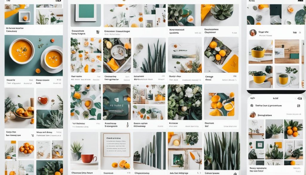
When it comes to Instagram grid aesthetics, Clare Paint stands out as a brand that has mastered the art of creating a cohesive theme. By carefully defining their brand personality and selecting a color scheme and font that aligns with their image, Clare Paint has achieved a visually appealing and consistent feed. Their attention to detail not only enhances their Instagram grid but also helps them engage their audience and leave a lasting impression.
With a cohesive theme, Clare Paint’s grid tells a story and conveys its brand message effectively. This consistency in visual presentation helps their audience instantly recognize their posts and associate them with their brand. Whether it’s showcasing its stunning paint colors or sharing interior design inspiration, Clare Paint maintains a consistent look and feel that resonates with its followers.
When planning your own grid, it’s essential to consider the importance of a cohesive theme. A cohesive theme not only adds visual appeal but also helps convey your brand’s message and aesthetic. By determining your brand personality, selecting a color palette, and staying consistent with fonts and visual elements, you can create a visually stunning grid that reflects your brand’s unique identity.
So, how can you achieve a cohesive theme for your Instagram grid? Here are some key steps:
- Define your brand personality: Clarify what your brand stands for and the message you want to convey through your Instagram presence. This will guide your choice of colors, visuals, and overall aesthetic.
- Select a color scheme: Choose a palette of colors that align with your brand and evoke the desired emotions. Stick to these colors consistently throughout your grid to create a unified look.
- Opt for consistent fonts: Select a few fonts that complement your brand’s personality and use them consistently in your captions, quotes, and graphic overlays. This will add an extra layer of visual coherence to your grid.
- Create variety within the theme: While maintaining a cohesive theme, you can still incorporate different types of content and visuals. Experiment with different post formats, such as product shots, lifestyle images, quotes, and behind-the-scenes glimpses.
- Plan ahead: Use grid planning apps like Preview and Planable to visualize your grid before posting. This allows you to test different layouts and ensure a harmonious flow of visuals.
A cohesive theme not only adds a professional touch to your Instagram grid but also helps you capture the attention and interest of your audience. By following Clare Paint’s example and implementing a well-defined and visually appealing theme, you can create an Instagram grid that truly stands out.
Different Types of Instagram Grid Layouts
In the world of Instagram, having an aesthetically pleasing grid can make all the difference. Luckily, there are various Instagram grid layouts that you can explore to create a unique and visually striking feed. By experimenting with different grid designs, you can showcase your content in creative ways and captivate your audience. Here are some popular examples to inspire you:
- Classic Grid: The classic grid layout features evenly sized square posts arranged in rows and columns, creating a clean and organized display.
- Puzzle Grid: With the puzzle grid, your posts are divided into sections that, when viewed as a whole, form a larger image or pattern.
- Horizontal Grid: As the name suggests, the horizontal grid focuses on arranging content in a horizontal or landscape format, creating a seamless scrolling experience.
- Vertical Grid: In contrast to the horizontal grid, the vertical grid arranges posts in a vertical or portrait format, allowing for a more immersive scrolling experience.
- Diagonal Grid: The diagonal grid adds a dynamic and visually interesting element by arranging posts diagonally across the grid, creating a sense of movement.
- Border Grid: With the border grid, each post is framed with a border, creating a unified and polished look.
- Checkboard Grid: The checkboard grid alternates between two different types of content, such as images and quotes, creating a visually engaging and balanced feed.
By choosing a grid layout that aligns with your brand’s style and content, you can create a memorable and captivating Instagram feed. Whether you opt for a classic, puzzle, horizontal, vertical, diagonal, border, or checkboard grid, remember to stay true to your brand’s identity and engage your audience with visually stunning imagery.
Continue reading to explore the benefits and considerations of Instagram grid layouts in the next section.
Benefits and Considerations of Instagram Grid Layouts

Utilizing an Instagram grid layout can offer numerous advantages for your feed planning and overall aesthetic. However, it’s important to carefully consider the pros and cons before diving in. Let’s take a closer look at the benefits and considerations of using grid layouts on Instagram.
Benefits of Instagram Grid Layouts
- Making a great first impression: An organized and visually appealing grid layout can immediately grab the attention of your audience, leaving a positive and lasting impression.
- Increase engagement: A well-curated grid can encourage users to interact with your content, leading to higher engagement rates, including likes, comments, and shares.
- Bulk content creation and scheduling: With a grid layout, you have the opportunity to plan and schedule your posts in advance, allowing for efficient content creation and consistent posting.
- Seamless and beautiful feed: A thoughtfully designed grid creates a cohesive and aesthetically pleasing visual experience for your followers, enhancing the overall user experience.
- Developing a consistent aesthetic and brand image: By using a grid layout, you can establish a consistent visual style that aligns with your brand, helping to reinforce your brand image and message.
Considerations for Instagram Grid Layouts
- Shifting focus towards authentic content: While grid layouts can be visually captivating, it’s important to recognize that Instagram is increasingly favoring genuine and authentic content over perfectly curated feeds. Finding a balance between planned and spontaneous content can be crucial for staying relevant.
- Compatibility with other platforms: Some grid layouts may not translate well on other social media platforms or websites, potentially limiting your content’s reach and impact beyond Instagram. Consider adapting your content to various platforms for optimal exposure.
- Consistent posting requirements: Maintaining an appealing grid layout often necessitates consistent and regular posting, which can be time-consuming and demanding. Ensure you have the resources and commitment to meet these requirements to sustain your desired grid aesthetic.
- Spontaneous content creation limitations: Rigid adherence to a grid layout may limit your ability to spontaneously create and share content in response to current events or trends. Strike a balance between planned content and the occasional real-time sharing to keep your feed engaging and dynamic.
As you delve into the world of Instagram grid layouts, remember to weigh the benefits against the considerations to determine the best approach for your feed planning. By carefully planning your grid layout, you can create an aesthetically pleasing and engaging Instagram feed that aligns with your brand and captivates your audience.
Conclusion
Planning your Instagram feed is more than just a creative endeavor; it’s a strategic way to captivate your followers and convey your brand’s unique style. By using apps like Preview and Planable, you can effortlessly arrange and schedule your posts, ensuring a visually appealing and cohesive grid design.
However, it’s not just about the apps; it’s about defining your brand personality and creating a cohesive theme. Clare Paint’s success is a testament to the power of a well-planned and visually consistent grid. With careful consideration of your color scheme, font, and overall aesthetic, you can leave a lasting impression on your audience.
Don’t be afraid to experiment with different grid layouts too. From the classic grid to puzzle grids, there are endless possibilities to showcase your content in creative ways. Choose a layout that aligns with your brand’s style and content, and watch as your feed becomes not just visually stunning, but also engaging to your audience.
In conclusion, through the proper use of apps, defining your brand personality, creating a cohesive theme, and exploring different grid layouts, you can plan your Instagram feed like a pro. Captivate your followers, leave a lasting impression, and build a strong and visually appealing grid that represents your brand’s unique identity.


